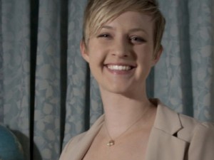
A few weeks ago, I had the opportunity to visit with many KCAD alumni at a reception held at Material ConneXion in New York City. I had the privilege of catching up with several alumni, friends, and colleagues; many of whom I plan to post about in January. At the reception, however, I happened to miss a recent Kendall graduate, Diana Frurip. But I have come across her work.
Diana graduated in 2009 with a degree in Interactive Design, now a part of Digital Media. She then left Grand Rapids for New York City, where she was awarded an internship at Kargo, a mobile development company. She spent her first summer there, and then took a full-time position with Sanborn Media Factory, which Frurip describes as a “multi-faceted design shop."
While Diana continued to develop her motion graphics and web design skills, she found herself working on many mobile projects, and for a broad range of clients. She says of her mobile experience, "the company was producing their first iPhone app when I started so I was learning to design apps as the company was learning how to build them." She spent two years at Sanborn Media Factory, sharpening her mobile app design skills by working on both iPhone and iPad applications. Then she moved on. Her current position is with R/GA, where she is the main designer for the mobile group (with a focus on the Android applications).
Diana describes her design process as heavily research-oriented. She explains, "when I start designing an application, I spend a good amount of time coming up with an audit of what apps exist in the same market and what new trends and features could be implemented."
Diana has worn several hats, with titles including interaction designer and visual designer. She uses her past experience when creating wireframes, and uses her branding experience by taking brand elements and working them into the application. She says of this, "Just because a brand's colors are pink and yellow doesn't mean that a pink and yellow app is the best answer." Diana mentioned that she frequently talks with developers during her process. This is important to insure that her ideas are applicable to each application.
It's quite fascinating, the world of mobile design. Primarily because it's such a young one. Also, it takes the right kind of designers to adjust, adapt, and adhere to the ever-changing process. With that said, there are fewer resources available to such designers. This is why Diana launched her own blog, Lovely UI. She mentioned Pattern Tap as her favorite resource for web design elements, but said "I was so frustrated when I couldn't find something similar for mobile. Then I thought, 'if I was looking for a resource like this, other people must be too.'"
Lovely UI
So she started her own by tracking key elements that she likes, but also tracking patterns and trends in mobile app design. Not bad. Lovely UI consists of iPhone and iPad screenshots. She said of her blog, "Starting Lovely UI was a real confidence booster because it allowed me to be an expert in my office and in my field. It helped show me I had a valid opinion even though I am pretty young in the industry. I'm very interested in the education side of it and soon I am going to use the space to talk about trends and best practices in mobile design."
Right now, the interactive world is very male dominated industry. I was curious to get some of Diana's thought about her role within the field. She says of this, "It's easy, for women especially, to take a back seat...But it is really important to know how to voice your opinion. UI is as much about knowledge as it is about opinion." With Lovely UI up and running, Diana is as many parts innovator and expert in the industry as she is designer.


